OttaDo
Creating an end-to-end MVP for a productivity app
Project Brief
For this project, we were expected to create an MVP end-to-end app. A client was looking to create a productivity app that helps users complete tasks more efficiently.
Role
UX UI Design, UX Research, Branding
Tools
Figma, Forms, Maze
Timeline
80 Hours, Mar 2022
Problem
Task tracking apps can be hard for some users to use, and some users prefer not to use them at all as they can be too complex to even get started.
Solution
Create a MVP app that helps users organize their tasks and make it simpler for them to complete their day to day tasks with ease.
Using the design process
Empathize
For this project, I began by empathizing to help me understand the market. I did this by completing a competitive analysis along with secondary research. I also conducted a survey to gain a better understanding of potential users for this new product.
Empathizing Goals
Before I started my competitive analysis and survey, I had to be sure I knew what my goals were to be able to fully empathize wit the market and potential users. I worked out some key goals to keep in mind while I did my empathizing research.
- Understand user preferences when it comes to todo lists
- Understand users needs and frustrations with existing todo lists
- Understand user motivations to use a todo list
Summary of Findings
With my empathizing goals in mind, I could now get to work on my competitive analysis and survey. Below are my key finding of both the analysis and survey.
Competitive Analysis
For the competitive analysis, I did research on potential competitors. I looked at what their strengths were as well as potential weaknesses. I also completed a secondary research of provisional personas. After completing this ramp up research for OttaDo, I came to the key
findings for my analysis:
- Most of the task tracking type of apps seem to all have a premium feature behind a paywall, making it hard for users to want to even try using a new product if they cannot trial it all at once
- Apps that incorporate games into your task seem to increase the likelihood of a user completing a task or creating a habit
- Ability to incorporate your calendar with your tasks, so all items are in one place for you see
- Creating an app that is complex yet minimalist seems to be what most users will gravitate to to help them stay on task or create a habit
Survey
Now with the competitive analysis complete, this helped me hone into what questions I should ask in a
survey to gain a better understanding of potential users of a new todo app.
Once I completed the survey, I gathered the responses and categorized them into key points: user needs and frustrations.
Needs
- Some users will try other methods of coping with stress and daily needs by meditating or keeping a journal.
- They need an app that is fun to use to want to keep using a todo app
- They like to be able to customize their lists, such as adding a sublist to their existing lists
- Would like an app that is organized with shapes rather than logical lists.
Frustrations
- Most users are stressed out on a daily basis and are just trying to power through it to manage
- Todo apps are usually too boring for users to keep using them so they end up not using them
- Mental health and conditions like ADHD makes it hard for some users to keep up with todo apps
- Most apps seem to be too linear making it easy to ignore a mundane list
Creating a Persona
Using what I learned from my empathizing research, I was now able to work on creating a persona. With a persona complete, this would help me in my decision making when it comes to key design choices.
Before I moved onto the defining phase of this project, I furthered my empathizing of the user by creating an empathy map. This would help me have a better grasp on all possible feelings a user may have towards todo apps.
Define
With my empathizing research complete, I felt confident to move onto defining the project goals.
Project Goals
I met with my client to go over what their goals were when it came to creating a new todo list app. I wanted to be sure I understood what their business goals were and how I could incorporate their goals into the user goals as well as technical goals.
Using what I had learned from my meeting with the client and my findings from the survey I conducted, I created a Venn diagram to ensure each goal aligned with other goals. In doing this, this would help me in my design decisions when it came to ideating this project.
Site Map
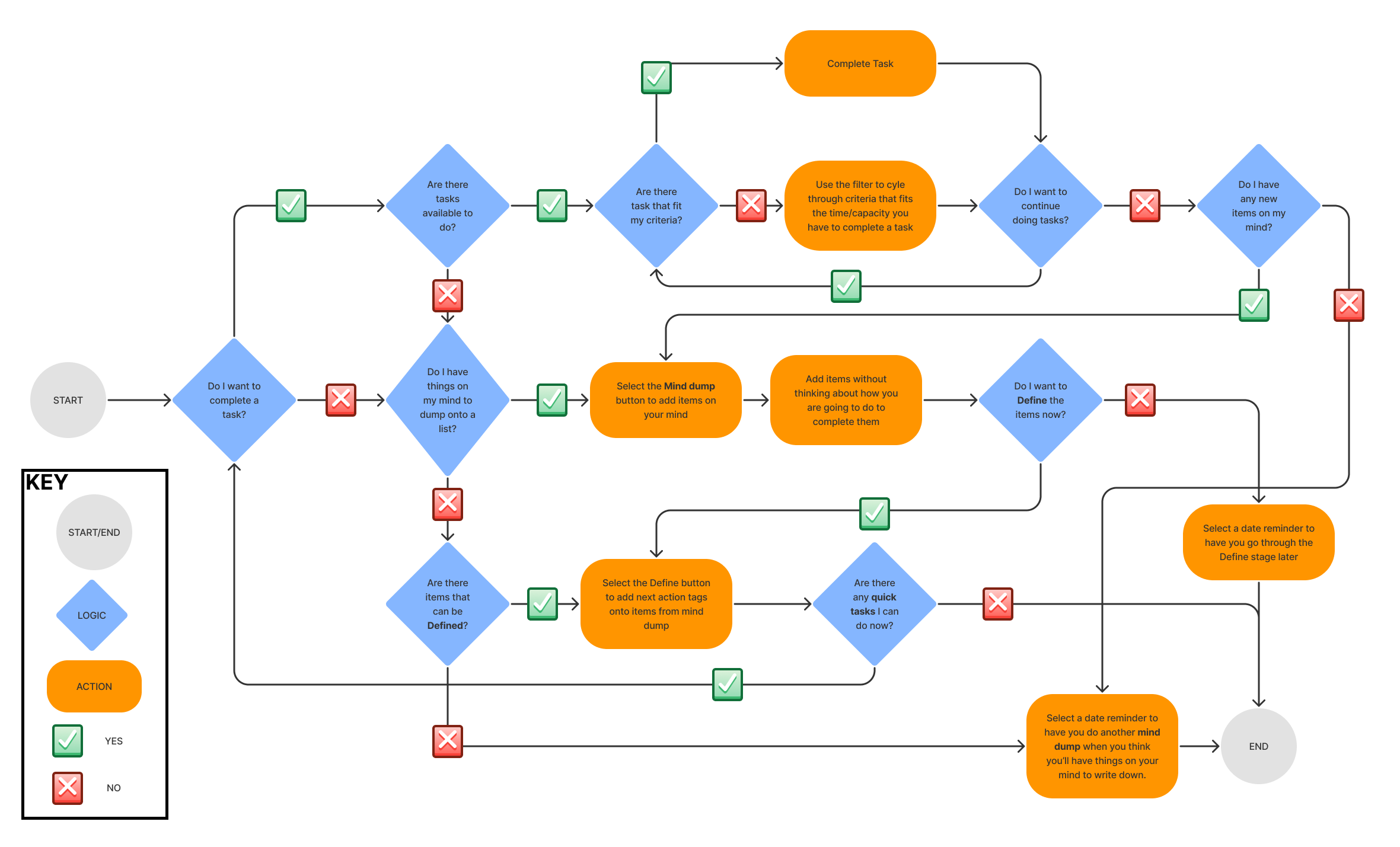
Next, I needed to define the sitemap for this new todo app. Working with the client, they told me their inspiration for the flow of their app came from a book called Getting Things Done by David Allen. They wanted to simplify the principles they learned from this book and incorporate it into an easy to use app. We went over the principles and discussed which ones would be the most useful in a new to do app.
After discussing, we came to the conclusion of using three of the main principles to incorporate into this new todo app. We ended up using different terminology for the principle that would still get the same idea across.
My
first sitemap iteration would have the users open the app and be presented with a random task they had entered previously. If no task were available, they needed to go through the mind dump section. Then if they want to right away, they could go and organize it into a category and then define the task. That was how it was originally laid out, but the UI was considered to not be very strong and needed some improvement.
From here on, I will be talking through my second iteration of this project. However, I will have links to my first iteration throughout this case study.
Based on my first run through, testing and re-meeting with my client, I came to the below sitemap for the reworking of this app.
Task Flow
Now with the site map complete, I could work through creating what a possible task flow may look like. My
first task flow iteration included letting the user shuffle through their tasks if they did not feel like working on the randomized task shown at first.
In this second iteration, through my re-meeting with my client, we came to the conclusion that a filtering system may work much better for the user in this case. Also, the client brought up that they would like to include calendar/notifications that would bring the user back to define or mind dump later if the user does not have the time to do it in the moment.
Ideate
Initial Sketches
Using what I had learned from my first run through of this project and my second iterations of the sitemap and task flow, I got to work on creating updated sketches for this project to hopefully be a better version of this end-to-end MVP project.
For this sketch, I wanted to make sure that they app was easy to follow and gave the user a little more control over the homepage. In my
first sketch, I had the homepage display only one random task. In my new iteration of this sketch, I have the homepage show all actions in order of importance based on the tags the user selected when they defined the task or in this case "concern." I also included a quick add button at the bottom of the screen if the user has something on their mind and they know what next action is needed.
The next tab, "mind dump," is where the user would write out all of their thoughts or concerns, without deciding what is needed to be done with them yet. In my first iteration, I thought that having the user enter one task at a time would work just fine so long as they used the plus button to add another. It would not show the last item you entered, giving the user a cleared entry point to enter another task. In this iteration; however, collaborating with my client, we came to the conclusion that making this more like a list form would work better. So kind of like a plain todo list, a user would just list out their thoughts and concerns, but this would differ as they do not need to think of how to work through or complete that task just yet.
In the final tab, "Define," is where the user would define the tasks they wrote out. The user is not expected to define right after they mind dump, as the mind dump is a task in itself and could be all the user has energy for in the moment. Once a user is ready; however, they can go through and start defining. There would be three different outputs that could happen. The first being they could just outright delete the concern/task as it is no longer relevant or it was completed without the need of defining it. Next they could add it to their personal calendars if it requires date specifics. OttaDo would then archive it, as that was the next action for that task and nothing is further needed. Finally, they could define the next action needed. This would bring the user to an edit screen where they would be required to fill out all the necessary information to make it onto your OttaDo list.
Creating Wireframes
With my sketches complete, I now went to work on the wireframes. I spent time creating a comprehensive wireframe that reflected what I had sketched out and would help me in working on the high fidelity screens later.
My new wireframes differ drastically from my
first wireframe iteration, but I was glad to be given the opportunity to fine tune this project to produce a better app for my client in the end. Using these wireframes, I felt good enough to continue to work towards a UI kit that would fit the clients need for branding.
.png)
UI Kit
Before starting the high Fidelity screens, I worked through creating the logo and branding for the app. First I worked on creating a Logo for my client.
In one of our meetings, they had mentioned that they had this idea to have an otter as the logo, as a play on the word "ought." The client already had a name for this app which helped me in creating a logo or so I thought. It took many more iterations than I thought to create a logo that I felt would work.
Once I had a good amount of options, I brought them to my client to see if they could help me narrow it down. After some deliberation, we came to the conclusion to use the face of one of the otters and make it more of a straight on look. I then created a SVG of the logo and showed it to the client, who was quite pleased with the ending result.
Next, I worked on creating a branding for OttaDo. To help me with this, I worked on a
mood board. In doing this, it was much easier to hone in to a color scheme I felt would work best for this new branding of a todo app.
With Orange being a very prominent color in my mood board, I decided to use that as the main color for branding. Choosing a secondary color was just as easy, as oranges complimentary color seemed to be the second most prominent color in my mood board.
This UI kit felt much better than my
first UI Kit. With the UI Kit and branding completed, I could then now implement them into my wireframes to create the high fidelity screens
High Fidelity Screens
Using my UI Kit and wireframes and what I learned from my
first high fidelity iteration, I got to work on creating the high fidelity screens. Again this iteration felt much better and much cleaner. The only way to be sure of that was to create a prototype.
Prototype
Figma prototype
Using Figma, I got to work on creating prototypes for testing in the next phase. I added additional screens to help the user along in the testing of each flow. For this run through of testing, I chose to make sure to prototype buttons that were necessary to test. I learned from my
first prototype iteration making the app too lifelike makes it difficult to gain a better understanding of the results from testing.
Testing
Testing Goals
My goals with testing were to see if the interface was intuitive and if the key features of the MVP were easy to understand. My
first round of testing went well enough, but only had a usability score of 72% based on maze.co's calculations. Using what I had learned in this testing, I took into consideration what was successful, what needed improvement, and what was unsuccessful. With that, I created an
affinity map for my first version of this testing. I had some good successes, but there was room for improvement on my screens as well as on how I prototype.
Using my learnings from my first prototype and test, I tested out my second version prototype and got
improved results! On my second round of testing, I got a usability score of 90%! Looking at the results from the testing and survey, this gave me the confidence that this was a very intuitive UI for this MVP project. I put together a different kind of affinity map below, showing the results from the survey and tester's thoughts on key questions I posed to them.
Results
The only real downfall was that it wasn't an existing app! The only confusion people had was not being about to do things in the order they pleased. I felt extremely confident in this reworking of the MVP product that I was excited to show the final product to the client.
High Fidelity - Finalized versions
The resulting finalized high fidelity screens felt much better than my
first finalized high fidelity screens. I feel very proud of this project and hoped the client felt the same.
Next Steps
My client was extremely pleased with how this version came out and would like to continue to work on this project with me. I plan to work with the client and help create more key screens needed to make this a full fledge app one day!


.png)


.png)
.png)
.png)


